Welcoming the infographics of ‘Afrographique’
By itself, data is boring. Rows and columns of numbers; a labyrinth of black on white. A data set may very well contain the secret to tomorrow’s resource allocation, but the numbers themselves lack cohesion and significance. Fortunately, graphic designers have come to the rescue – and are even giving attention to Africa!
Just last week, Ivan Colic, located in South Africa, started a site devoted to the visualization of African data. Afrographique, which runs on tumblr, already hosts a dozen custom graphics using sources ranging from Google’s World Bank data, Wikipedia, Alexa, IWS, and Socialbakers, to name a few. The author explains the purpose of the site as his
…small contribution to assist the changing perception of Africa and it’s people – hopefully you will be able to learn something as well. This blog aims to collect as much data as possible with the aim of presenting the information in an exciting and digestible format to all.”
The quantity of visuals is impressive, to say the least, and given current trends, should prove effective in spreading the word on the status and future of Africa’s Internet. After all, Internet users are becoming increasingly visual learners as attention shifts from conventional blogs to micro-blogging platforms such as tumblr. And, web surfers face more distractions than ever as the number of websites proliferates. Infographics are therefore a great solution to text-based data analysis. And, if a visual truly intrigues an individual, he or she will presumably seek to learn more about the data through more descriptive textual means.
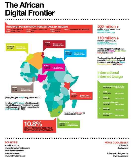
Back on Afrographique, posts like “The African Digital Frontier” shows Internet and Facebook user stats for the largest nations, with color-coding for the rest of Africa. “Facebook in Africa” simply visualizes the data from Socialbakers. In general, Afrographique’s representations tend to have everything necessary to be effective: simplicity, color, and a point of reference (ie. mentioning global stats along with the African data).
Still, all infographics face inherent challenges with – you guessed it – data:
- Accuracy of data. For example, Socialbakers does not list their source of Facebook data, so any visualization relying on this source should use caution.
- Recency of data. Visualizations are great, but since data is often 1-2 years old, we must remember that many infographics depict a state of Africa’s Internet page.
- Availability of data. Often, African data is limited to the most populous countries. Accordingly, these nations will be absent from a corresponding visualization.
- Necessity of an infographic. Not all data warrants an infographic and the old quality over quantity adage could apply. For example, “African Facebook Users by Gender” seems unnecessary – the gender breakdowns within each country – and data is only available from 1/3 of African nations – are essentially similar within margins of error. A quick chart could effectively summarize this trend. The time saved could then be applied toward another infographic.
Don’t forget: the folks at Appfrica also tend to produce a handful of infographics every year (notably 2009’s Infostate of Africa).


 Twitter
 Facebook
 Pinterest
Could you precisely explain how the number of Internet users is defined ..I don’t believed we can compare users figures in industrial countries with individual access and developing countries where access are mainly collective § Thanks jmblanchard@9online.fr
http://tic-developpement.com
The definition of an Internet user is somewhat hazy and I agree that we probably shouldn’t compare Western figures with African figures due to the nature of Internet access points (private in developed nations and more public in developing nations). Currently, the widely used ITU Internet penetration stat is defined as: “The estimated number of Internet users out of total population. This includes those using the Internet from any device (including mobile phones) in the last 12 months.” The ITU tries to conduct household surveys, but when these are not feasible, they make an estimate based on Internet subscription rates. Source: http://www.itu.int/ITU-D/ict/material/TelecomICT%20Indicators%20Definition_March2010_for%20web.pdf