Vintage Internet maps, 1991-2003
Internet maps were once all the rage. Simple, yet powerful, these visualizations contributed to the creation of robust global networks. They monitored progress and showed which areas needed better capacity. Increased worldwide recognition of the importance of the Internet led a number of international development assistance initiatives. What’s more, these simple charts and graphs paved the way for the infographics of today.
Mappa.Mundi Magazine ran a “Map of the Month” feature from June 1999 – September 2001. Last revised in 2007, The Atlas of Cyberspaces provides a top-notch archive of maps from sites that are often no longer in existence. Google searches turn up a few more vintage maps. The beauty of these old maps lies in the diversity of how they express data. Designs range from conceptual to artistic to geographic to topological. Other maps show cables & satellites, traceroutes, and census information.
The pitfall with many of these maps is that they only classify information at a continental or national level. In many cases, a nation can be considered as having Internet access even if that access comes via an expensive link in only a single city. Still, it is beneficial to see how far African nations have come (and, it never hurts to pay homage to the Internet pioneers!):
- The cartographic approach employed by MIDS is to map the geographic locations of the Internet hardware as symbols on a world map. The number of hosts is aggregated for major cities and countries and then represented on the map by the colored circles. The data on this map is deceptive in that the size of the circle does not grow at the same rate the number of Internet users it represents does. However, such a scale allows quite a few African data points, especially given the early stages of networking in 1999:
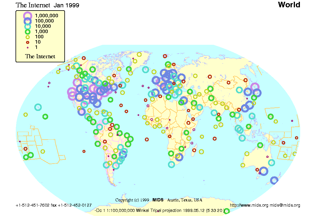
The Internet, January 1999. South Africa leads the continent, and coastal areas have limited access. Click to enlarge. {MIDS Maps of the Internet World}
- Palantir is a visualization tool that can be used to display the origin, volume and type of the incoming requests of a web server. Requests in Africa were sparse in 1995:
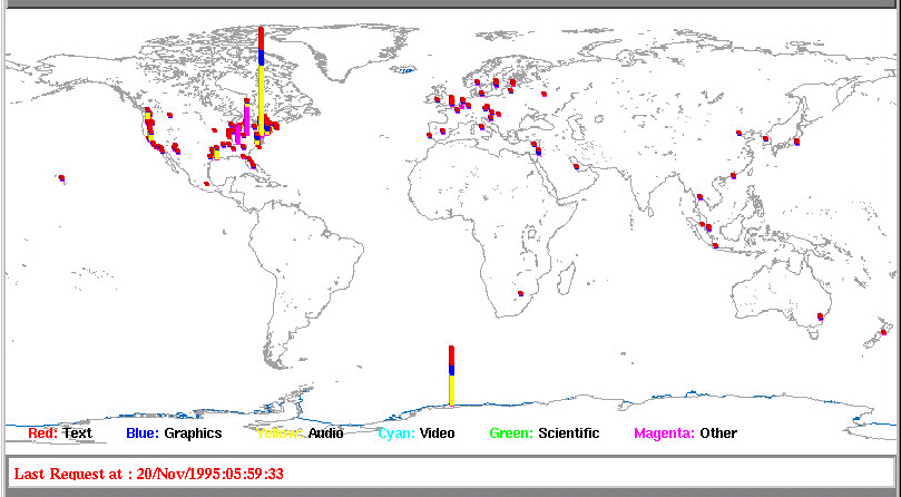
In 1995, only Johannesburg registered enough traffic to appear on this map. Click to enlarge. {Palantir}
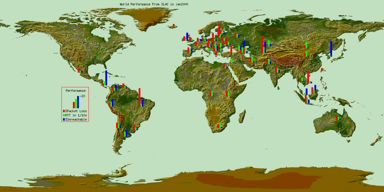
- Next is a single frame from an animated map showing monthly Internet performance measured from Stanford to around 70 different countries across the world. Cairo, Nairobi, Johannesburg, and Kinshasa(?) are represented:
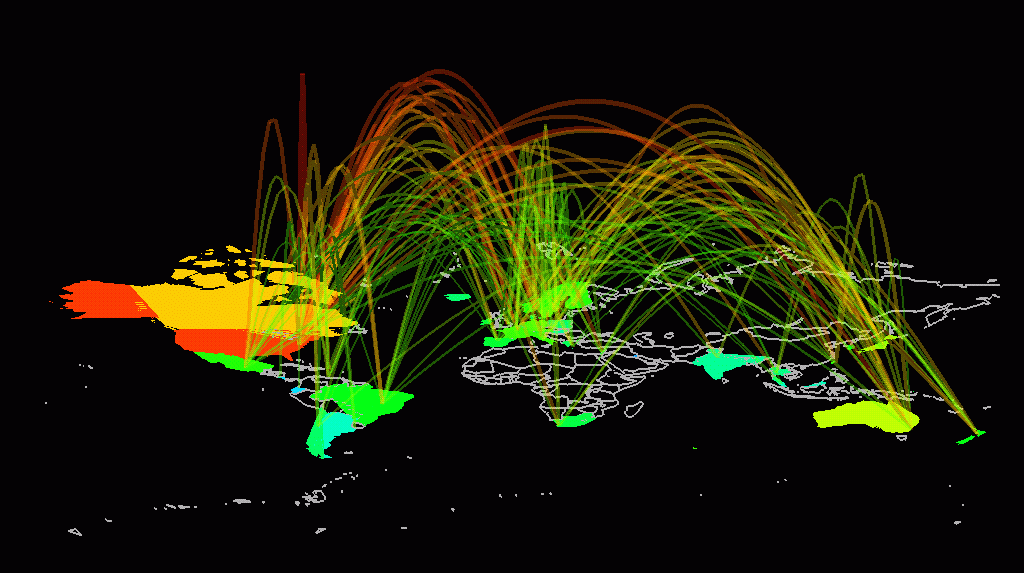
- The arc map displays a 3D network structure as arcs curving smoothly above a flat map of the world. The data being visualized is Internet traffic flows between fifty countries, as measured by the NSFNET backbone in 1993. The color, thickness and height of the arcs is used to encode the traffic statistics for particular inter-country links. South Africa appears new to the Internet in 1993:
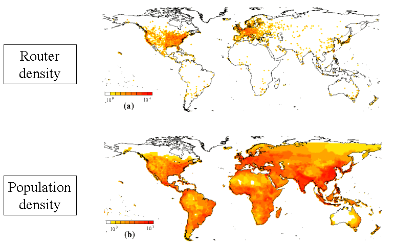
- This map produced by three researchers at the University of Notre Dame compares the geographic distribution of Internet routers (top) against the global distribution of population (bottom):
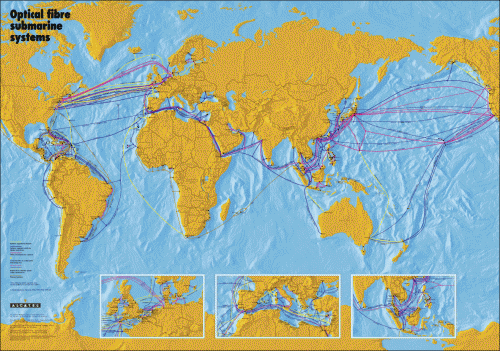
- The Alcatel map of submarine cable systems across the globe as of 2001. Notice how East Africa lacks an undersea cable:
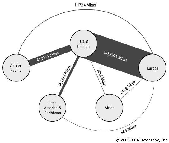
- TeleGeography, the authoritative source for telecom data, presents an interesting visualization of cable capacity. Notice how thin the lines connecting Africa to the rest of the world were in 2001:
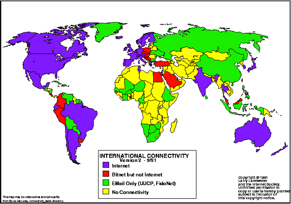
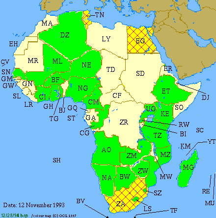
- Larry Landweber, of the Computer Science Department at the University of Wisconsin – Madison, produced twelve Internet census maps over a period of six years, providing us with a useful and fascinating visual census of the spread of international network connectivity. All of his maps can be found here. The map below shows levels of network connectivity in September 1991. Not a single African nation has true Internet, although Egypt was close:
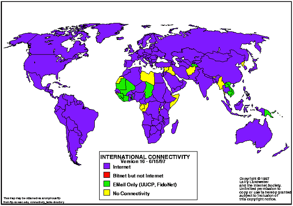
- The map below shows the connectivity position in June 1997. Libya, Western Sahara, Equatorial Guinea, Gabon, Congo, Somalia, Rwanda, and Burundi still lack Internet:
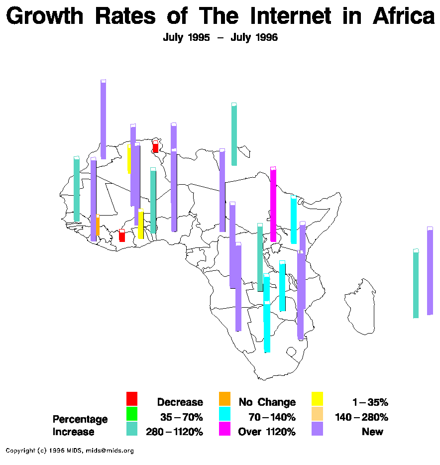
- Internet pioneer John S. Quarterman produced the first statistical maps of the Internet. An example of his growth rate maps is below. Interesting that Tunisia and Ivory Coast both showed negative growth:
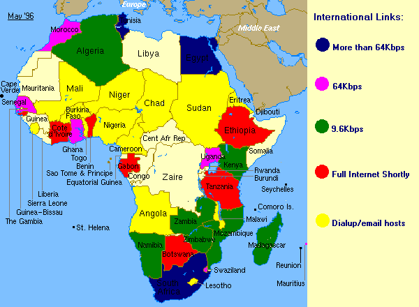
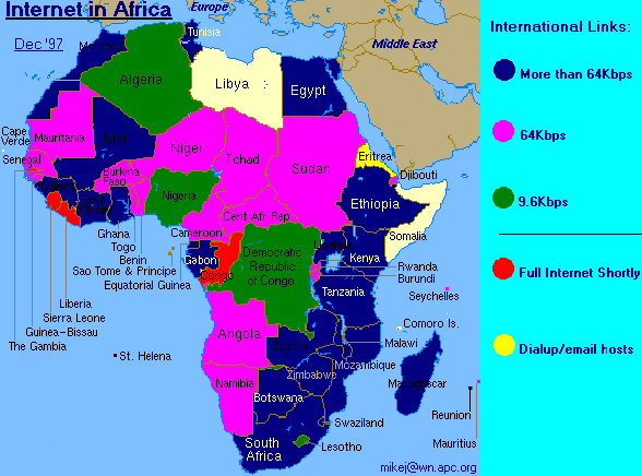
- Mike Jensen has tracked the Internet in Africa for decades. The two maps above show the changing level of Internet access and international bandwidth between May 1996:
and December 1997:
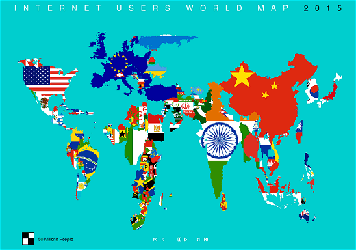
- In 2003, artist Antonio Scarponi compiled an animation utilizing a map of world flags to visualize the growing number of Internet users. The animation starts in 1993 and stops in 2015 – the time where the author estimated the entire world would be online. African growth accelerates around the year 2007 (perhaps a bit earlier than we’ve actually seen):
- The Network Startup Resource Center (NSRC) maps are similar to the Larry Landweber and Mike Jensen maps of the era:
Newer maps can be found on the oAfrica Maps page.




 Twitter
 Facebook
 Pinterest
[…] the world is and where you might be surfing on the internet if you search internationally. (OAfrica) TouchGraph SEO Browser: Java application to show the connections between […]
Hello — can you tell me who generated the fourth image down from the top, the one that shows the world in flat form with the arcs of internet connections over it? The caption begins: “The arc map displays a 3D network structure as arcs curving smoothly above a flat map of the world” I would like permission to use this image in an academic publication. Please email davidwang@wsu.edu
Hi,
I originally found this visualization in Mappa.Mundi Magazine. The image is © Stephen Eick, Bell Labs / Visual Insight. Source: http://mappa.mundi.net/maps/maps_008/
Tim