The challenge of visualizing Google search volume
Thanks in part to a spirit of openness and experimentation, Google’s Chrome browser has gradually attracted a substantial user-base since it was launched in 2008. Chrome Experiments, an official outlet of Google, features user-submitted projects that showcase web programming talent from around the world. Most of the 200+ projects are simply fun explorations of the power of programming. Best yet, one even relates to African Internet habits.
(Note: The Google Chrome browser is required to view and interact with the experiment.)

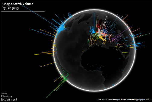
Blue: English, Lt. green: French, Yellow: Arabic, Dk. green: Portuguese. Click to visit {code.google.com/p/webgl-globe/}
Submitted just last week, WebGL Globe, an experiment authored by the Google Data Arts Team, utilizes WebGL (used to power HTML5) to merge Google search volume by most popular language by latitude/longitude. Vertical spikes represent search volume and color represents the most popular search language for a given lat/lon grid unit. The result is a colorful three-dimensional globe…that unfortunately resembles the ubiquitous light pollution maps.
Why? The threshold needed to plot a data point is apparently higher than the African mean, so most of the continent is left in the dark. (The authors do not specify the search volume threshold or the grid dimensions). In order to be more useful, the number of Google searches would have to be normalized against the population density.
Still, even when presented in a global context, WebGL Globe gives an idea of how languages are spread out, the location of urban areas, and how Ghana, Nigeria, Kenya, and South Africa have relatively strong online presences. Interestingly, the English language appears to be commonly used for Google searches across Africa. Is this due to a lack of local content, do African Googlers comfortably use English, or do searches in other languages fall below the data threshold for this visualization?
It would be interesting to visualize search volume:
- normalized to African levels
- per capita
- per Internet user
- regardless of search language
The Google Data Arts Team encourages others to build upon their code. Perhaps someone with JavaScript knowledge will modify the project to highlight African trends?


 Twitter
 Facebook
 Pinterest